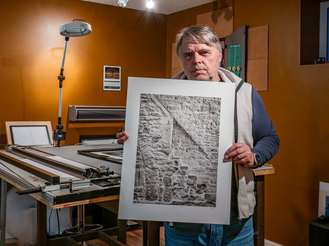


I recently spent two hours at Royce Howland Print Studio talking about paper. "How can there be that much to talk about," you might ask? Well there is plenty! Royce is a master printer and one of the best people to spearhead this conversation. . . not to mention that he has a paper supply in the range of six figures ($$$$$$).
As a traditional landscape photographer, I shoot with the intention of putting my best images on paper. I consider paper to be of critical importance in the presentation of my images. With the myriad of options in the digital realm, it’s easy to feel overwhelmed. In the past, I’ve preferred gloss papers on which to print my work, but I’m leaning more and more to matte papers these days.
I'm about to start printing my Italy 2023 Collection and I have some very specific requirements with regards to putting those images on paper. Italy has such deep history and I want to portray that sense of history in my prints. There are some beautiful textures in the images I have captured and I want these textures to translate to the image on paper. I also knew that I would want a robust paper because the portfolio would consist of loose prints which would need to withstand frequent handling.
 To achieve the look I’m after, my thought was to print with a warm tone on a cold pressed, heavyweight, matte paper. I’ve printed a few images on Epson Hot Press Natural which is a very nice sheet, but decided it’s not the look I want. Rather than guessing what paper to use, I decided to consult with an expert.

I gave Royce (Howland) a call to see if I could spend some time with him and get his recommendations. I explained my goals for this particular portfolio to him and we zeroed in on a half dozen papers that fit the bill. Royce is so collaborative, he offered a couple of sheets of each paper for me to try out on my Epson P6000. I know that not all photographers enjoy this luxury service, so I’ll lay out the details of our conversation and show samples (as best I can on screen) of the papers we looked at.

My requirements were to source a fairly "stiff" sheet that had a weight of at least 300 gsm and I also wanted the texture of a cold-pressed paper. Hot press papers have a smoother surface with less “tooth” while cold-pressed papers have a more textured surface (to varying degrees). Cold press papers may also be more absorbent and the ink reflects light differently due to the more textured surfaces. This tends to result in a softer rendering of the image. That’s exactly what I want for these images of Italy. Some papers also have a bright white or a natural option and I am partial to the warmer tones of the natural sheets (especially for this project). One of the comments Royce made off the top was that the more heavily textured papers were best suited for larger prints because for smaller prints, the paper texture can sometimes compete with the image. My portfolio was going to be printed to 17x22 inches so this would not be an issue for me. We looked at a few options from each of the Hahnemühle and Canson paper lines. Both of these manufacturers have impressive lineage and have been making papers for hundreds of years.
Hahnemühle is a German manufacturer who has been making paper since 1584. They have a complete line of high quality, mould-made papers for digital fine art printing using cotton rag, cellulose, hemp, bamboo and agave fibres; quite a range of options.
Canson has an equally impressive line of high quality mould-made papers. They also distribute a line of papers from Arches (a cotton rag paper I used in art school). Arches (pronounced "Arsh") have been producing paper since 1492 and are the oldest paper manufacturer in France. This is the sheet I'll probably be using for this portfolio
Bear in mind that the papers we looked at were for this specific project and are not necessarily the only papers that can achieve a top notch result. That being said, I suggest finding papers that suit your vision and stick with them. Rather than descending down the paper “Rabbit Hole” get to know and understand a few sheets and the way those sheets respond to your printing environment. This eliminates the variability of an unfamiliar paper source and allows you to zero in on the desired end result. Having a gloss sheet or two and a matte sheet or two is all most photographers would need. Keep it simple (KISS) and minimize headaches!
Hahnemeulle was the first grouping that we looked at. All of the sheets were 100% cotton rag.
Hahnemeulle William Turner: 310gsm. This sheet had a beautiful sand papery texture which was very noticeable to the touch. At 310 gsm it also had a very nice heft to it. My only concern was that the delicate surface structure could become easily scuffed from handling the portfolio.

Hahnemeulle Museum Etching: 350 gsm. This sheet was the heaviest weight and had a beautiful heft. It also had a subtle random texture to it which was quite beautiful. At 350 gsm you could use this paper as a weapon in a pinch.

Canson Printmaking Rag: 310 gsm. This sheet had a subtle random texture. It was ok but I considered some of the other sheets to be more in line with the textured look I was after.

Canson Arches Aquarelle Rag: 310. This sheet had the most uniform texture to it and was my least favourite because of this.

Canson Arches Velin Museum Rag: 315 gsm. This was a beautiful sheet and would have been a contender but it was unfortunately, no longer available.

As with every meeting with Royce, I left his studio with a few, key takeaways. I had always thought that Canson papers were an economy brand. They are not! Royce uses Canson and Hahnemeulle equally and some of his favourite papers are from the Canson lineup. I also learned that some of the Hahnemeulle papers use optical brighteners which can break down over time when they interact during the process of reflecting light. This can take a very long time to occur, but it was still a factor in my final paper choice. Canson uses no optical brighteners in most of its papers. The brand also produces a sheet in collaboration with Arches, BFK Rives which I used in art school back in the early 80’s for watercolour work. How exciting! This sheet is available in white and bright-white options. It’s “molto bene” and the one I’ll be working with for my Italy portfolio!